User Manual
Introduction
All datasets are assumed to be available in a preprocessed, normalized and tab delimited ascii form. For more details see the Data section or the example files available in the Download and Installation section.
Data manager
By launching SEURAT the data manager window will appear:
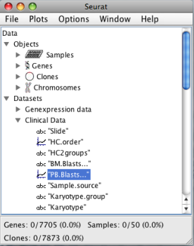
The data manager displays the different datasets and the corresponding variables loaded into SEURAT. Detailed information about each file and the variables stored can be accessed with a click on the name of the respective dataset. SERUAT provides a "Loadings Settings" menu where the user can specify the names of the required columns. In addition the manager window shows the objects described by the datasets. These objects are genes, samples, CGH clones, SNPs and chromosomes. Summary information about each single gene, sample, CGH clone and SNP can be accessed with a double click on the corresponding objects. The lower margin of the data manager window displays the number of genes, samples, clones and SNPs loaded and the proportion of objects currently selected. At the top of the data manager window is the main panel from which most of the functions can be accessed:
- File
- -open/close different data files
- -loadings settings
- -save data files
- -close all data files
- -exit SEURAT
- Plots
- -open heatmap plots for gene expression and genomic gain and loss information
- -open the chromosome map
- -open an eventchart to display time to event data
- -perform clustering and seriation algorithms
- -open the confusion matrix to compare clustering results together with clinical variables
- Options
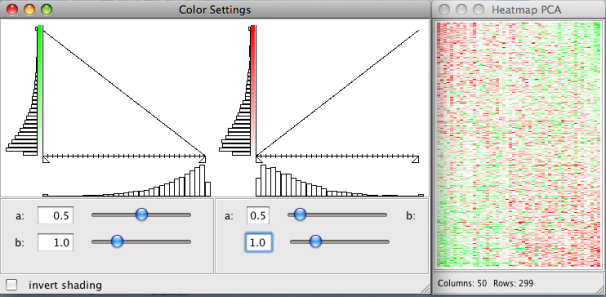
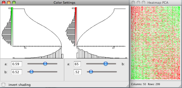
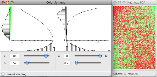
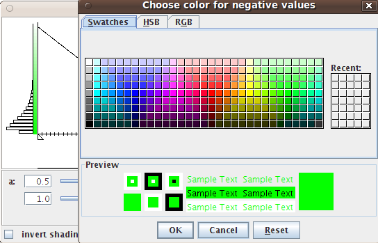
- -change the pixel settings of the heatmaps
- -change the color settings of the heatmaps
- Window
- -list of all opened windows
- -close all windows
- Help
- -open this website
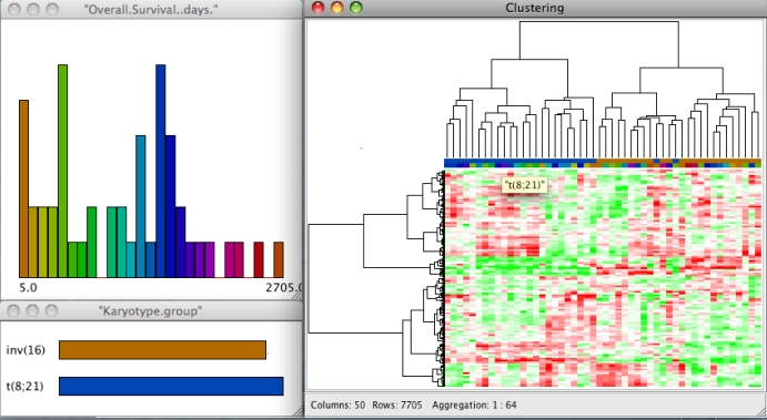
Interactive genexpression heatmap
An interactive heatmap showing the gene expression data can be called from the main panel by:
Plots → Heatmap Genexpressions
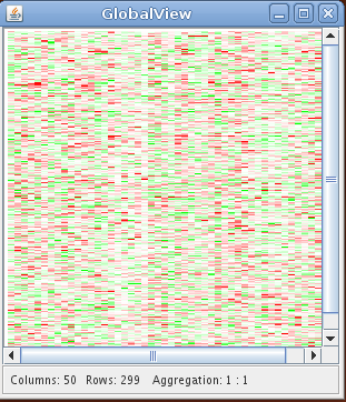
The heatmap plot displays the gene expression data with the gene expression levels represented by colors. The rows and the columns of the heatmap correspond to the genes and the samples. Due to the limited number of available pixels (even for high resolutions), it is usually impossible to visualize a high dimensional data set with each expression value represented by one pixel. In this case nearby expression values are automatically aggregated and visualized by one pixel. The lower margin of the heatmap plot shows the number of rows and columns and the aggregation ratio. The aggregation ratio can be changed with the arrow keys. The
Pixel and color preferences of all heatmap plots can be changed under:Plots → Pixel Settings
Plots → Color Settings
Clustering and Seriation algorithms
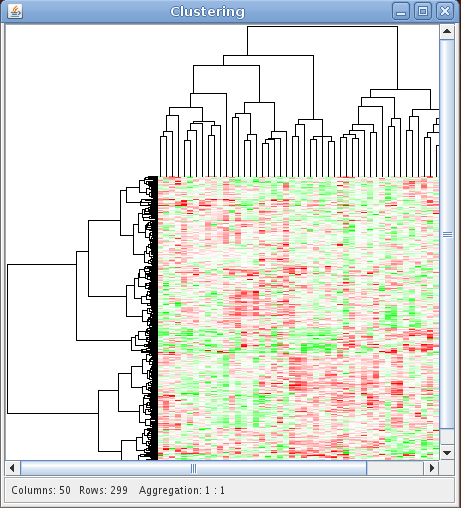
A clustering of the gene expression data can be performed by:
Plots → Clustering
SEURAT provides agglomerative hierarchical clustering and k-means clustering. In order to perform a k-means clustering, the user has to choose this from the available methods and provide the number of desired sample and gene clusters. Otherwise SEURAT will perform hierarchical clustering. For both algorithms different types of distance measures can be chosen, e.g. euclidean, manhattan, pearson. To perform hierarchical clustering several linkage functions are available, including single, complete, and Ward. The distance measures and linkage functions for clustering genes and samples can be chosen independently. The results of hierarchical clustering are visualized by a reordered heatmap together with the resulting dendrograms. Within the "Count:" field the user can give the number of clusters in which the data set will be clustered. For k-means clustering the user has to specify the number of clusters and otherwise SEURAT will prompt a warning. In this context "Columns:" and "Rows:" represent sample and gene clusters. If the user specifies the number of gene and sample clusters and chooses a hierarchical clustering method, the dendrogram will be cut according to the number of clusters and will not be drawn. Instead, cluster boundaries will be drawn on the reordered heatmap, as for the results of a k-means clustering. Furthermore, it is possible to apply all of the described algortihms to selected subsets (resulting cluster) of the data.
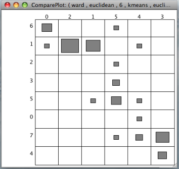
The results of two clusterings can be compared by a confusion matrix. This graphical tool displays objects falling into the same clusters by rectangles with size proportional to the number of objects. A function to permutate the columns and the rows of the matrix to match the clusterings is available with a right click on the confusion matrix. In addition the confusion matrix can be used to compare the clustering result with any clinical variable or gene annotation.
Plots → Seriation
Seriation algorithms aim to find an optimal linear ordering of objects according to some loss or merit function. This is a combinatorial problem that is hard to solve for all but small data sets. The number of possible solutions (permutations) grows with the problem size. Within SEURAT we provide the following seriation methods:
| PCA | Principle Component Analysis | Uses the projection of the data on its first principal component to determine the order. |
| MDS | Multidimensional Scaling | Use multidimensional scaling techniques to find an linear order. |
| BEA | Bond energy algorithm | Heuristic procedure to rearrange the columns and rows of a matrix such that each entry is as closely numerically related to its four neighbors as possible. The algorithm tries to maximize the measure of effectiveness of a non-negative matrix. |
| ARSA | Anti-Robinson seriation by simulated annealing | A simulated annnealing approach that finds a linear order by bringing the dissimilarity matrix into perfect anti-Robinson form |
| BBURCG | Anti-Robinson seriation (unweighted) | A unweighted branch and bound approach that finds a linear order by bringing the dissimilarity matrix into perfect anti-Robinson form |
| BBWRCG | Anti-Robinson seriation (weighted) | A weighted branch and bound approach that finds a linear order by bringing the dissimilarity matrix into perfect anti-Robinson form |
| TSP | Traveling salesperson problem solver | Seriation by minimizing the length of a Hamiltonian path through a graph is equal to solving a traveling salesperson problem. The goal is to find the shortest tour that, starting from a given city (object), visits each city in a given list exactly once and then returns to the starting city. |
Chen | Rank-two ellipse seriation | Finds a rank two correlation matrix of the original distance matrix. Projecting all points in this matrix on the first two eigenvectors, all points fall on an ellipse. The order of the points on this ellipse is the resulting order. |
In case of large data set, e.g. >500 gene, we strongly recommend to use onyl PCA, MDS and the BEA. All other methods aim to find exact solutions to the seriation problem and are thus extremly time consuming. More information about the implemented seriation algorithms can be found here. Besides classical one-way clustering approaches we provide some biclustering algorithms that are available under:
Plots → Biclustering
Biclustering is the simultaneous clustering of rows and columns of a data matrix. Ordinary one-way clustering algorithms cluster objects using the complete feature space, e.g. a clustering of the genes with respect to the gene expression values of all patients. Biclustering algorithms take into account that correlations between genes may only be present for a subset of patients and vice versa. In addition, biclustering algorithms do not assign all objects to a cluster and depending on the biclustering algorithm resulting biclusters are allowed to overlap. Genes that are members of more than one bicluster may be regarded as being involved in more than one biological process. Until know SEURAT offers two biclustering algorithms:
| Bimax | A fast divide and conquer approach that needs a binary input data matrix. Thus the gene expression matrix has to be binarized beforehand. For binarization the user can choose the proportion of ones and the type of regulation, e.g. up- or down regulation. |
| Plaid Model | The Plaid Model algorithm fits an additive model of possible overlapping layers to the gene expression matrix. Each layer/bicluster corresponds to a two-way ANOVA model with additive gene and sample effects. The user can specify the row- and column release thresholds that are used for pruning ill fitting genes and samples. We recommend to use parameters in the range of 0.5 to 0.7. Smaller thresholds will result in larger biclusters. The importance of each layer is tested against layers returned after random permutations. With the parameter shuffle iterations the user can specify the number of random permutations. Increasing this parameter will result in less but more important (e.g. strong gene and sample effects) biclusters. |
Exploring gene annotations and clinical data
Clinical data and gene annotations can be accessed via the data manager window with a double click on the name of the variable. SEURAT automatically recognizes the types of different variables. Continuous variables are visualized by histograms and categorical variables by barcharts. Information about functional groups, e.g. Gene Ontology, KEGG, or user defined groups, is visualized by barcharts.
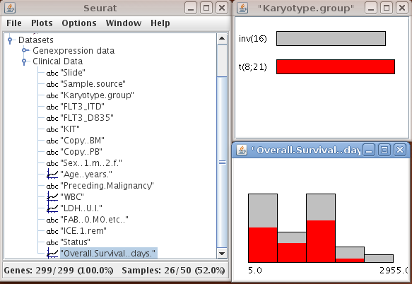
It is possible to assign colors or to change the binwidth of the histogram via the options menu of the plots which is available with a right click on the window. The top line of the heatmap displays the colors of the samples falling into the different classes.
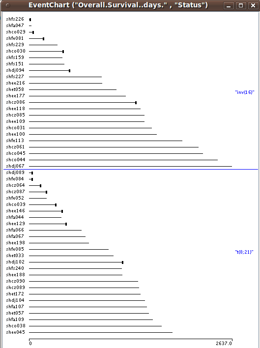
For many clinicians some of the most interesting clinical data collected are survival times and other time to event data. Often, interest lies in how time to event data is related to certain gene expression patterns or genomic variations. In SEURAT time to event data can be visualized by so called eventcharts. Eventcharts display each individual observation by horizontal lines and this representation. When dealing with time to event data, possible censoring has to be considered. To display observed events within the eventcharts a small vertical bar is drawn at the end of the horizontal line. A missing bar indicates that the event of interest has not been observed and thus the observation time is censored. With right click on the eventchart it is possible to reorder and group the horizontal time lines according to other clinical variables.
Plots → EventChart
Chromosome map
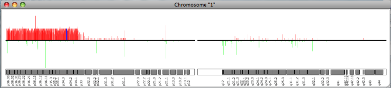
If array CGH or SNP array data is available, SEURAT offers a chromosome map. This plot displays all chromosomes together with the relative number of samples showing a genetical change. For each array CGH clone or SNP along the chromosome a red bar corresponds to the relative number of samples showing a genetic gain and the green bar displays the relative number of losses of the respective DNA segment.
The chromosome map is available under:Plots → Chromosome View
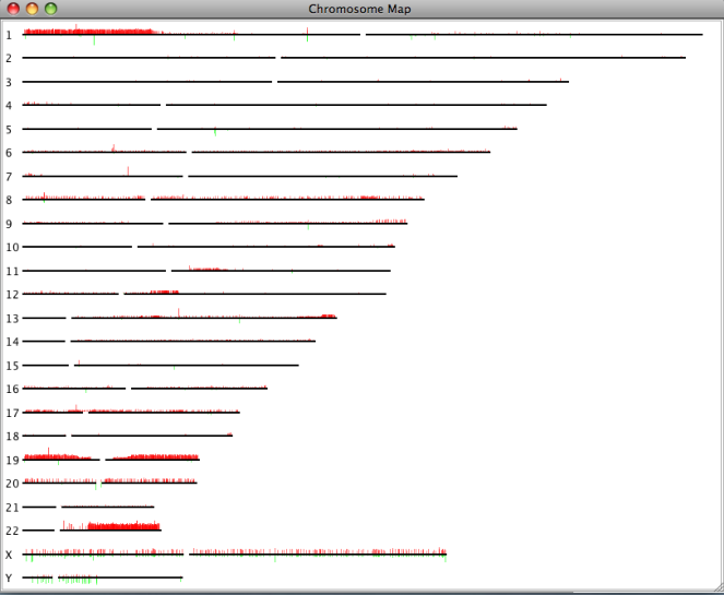
The single chromosome plot can be opened via the data manager with a double click on the name of the chromosome of interest. In addtition to the red and green bars showing the relative number of different genetical states, this plot also displays the single cytobands where the array CGH clones or SNPs are located.
The resolution of both types of plots can be changed with the arrow keys.